THE DATA LEAKED FROM the University of East Anglia should not be discredited simply because it was leaked. Even those sceptical of man-made global warming may find surprising conclusions based on examination of the data.
For example, one truly astonishing thing about global warming is how little warming is actually happening, at least compared to the amount of warming that led climatologists to predict global disaster. Using data from East Anglia (and graphic elements from conventional sources), this article documents the changes that are occurring and examines the predictions that have been made.
We can begin with a summary.
• Atmospheric CO2 is increasing by 1 to 2 parts per million per year
• Temperatures have increased by 0.9⁰C in the last century
• Oceans are rising by 2 – 3 mm per year
• 0.004% of global ice is melting per year
How global warming works
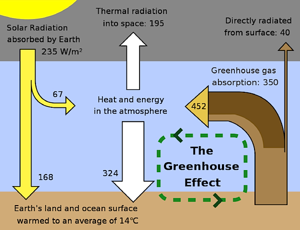
Solar radiation strikes the earth and is reflected to the atmosphere. Some of the radiation is trapped in the atmosphere and re-radiated back to earth. Were not for this greenhouse effect, the earth would be 35°C colder and possibly too cold to sustain life properly. [4]
CO2
Most people seem to agree that CO2 in the atmosphere has increased from 280 ppm (parts per million) at the beginning of the 20th century to around 380 ppm currently. However, this is subject to debate since the methods of measurements 100 years ago are not the same as they are today. There are credible chemical analyses performed 150 years ago[1] showing as much as 500 ppm CO2 in the atmosphere. In short, the generally accepted current increase is around 1 to 2 ppm per year.
The main greenhouse gas is water vapour which varies from 2 percent to 4 percent of the atmosphere. On its own an increase in of 1 to 2 ppm of CO2 would not cause significant warming. Global warming theory is based on the idea that a small increase in CO2 causes a more substantial increase in water vapour in the atmosphere which is responsible for the projected warming.
Two percent of the earth’s CO2 is held in the atmosphere compared to 91 percent in the oceans, which absorb CO2 when cold and release it to the atmosphere as they warm up. Ice core data clearly shows that the volume of CO2 in the atmosphere lags temperature by 800 years, i.e. atmospheric CO2 is driven by global temperature and is not the primary cause of it. The 800-year lag is because the oceans are large and take long time to warm.[2]
Because the amount of CO2 released by man has been increasing, the rate of warming should also be increasing, but this is not borne out in the data. Warming in the first half of the 20th century is exactly the same as in the second half.
Global Temperature
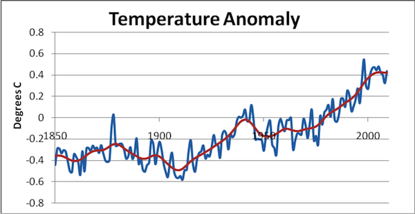
According to the Inter Governmental Panel on Climate Change (IPCC), temperatures have increased by 0.9 ⁰C in the 20th Century. Temperatures have not increased in the last 10 years. The graph below is published by the University of East Anglia Climatic Research Unit who supply this data to the IPCC.
The warming reported here occurred in two roughly equal phases; 1910 to 1940 and 1970 to 2000. Predictions of sudden increases in temperature (+2⁰C to +5⁰C by 2050 to 2100) are not supported by the data which shows modest warming.
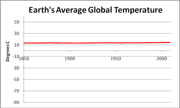
All in all, the actual temperature rise over some notional average temperature represented by 0⁰C, is a fraction of a degree Centigrade. This point is best illustrated by re-plotting the IPCC / University of East Anglia data to a more reasonable scale. The earth’s temperature range is from -89°C to +58°C and this gives us the Y-Axis in figure 3. The temperature anomaly is added to the earth’s average temperature of +14°C.
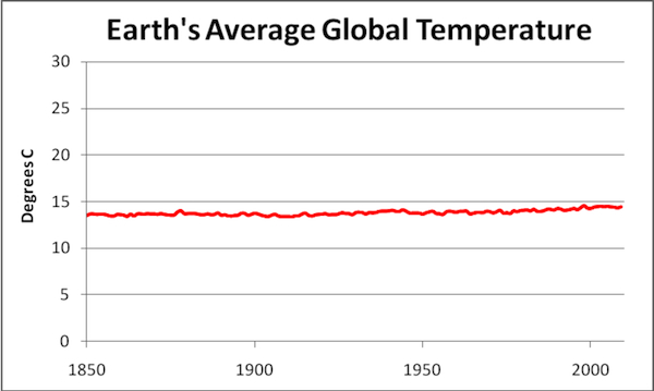
One might argue that, just as plotting temperature as an anomaly is alarmist, plotting it to this scale masks any possible problem. However, it makes little difference to the overall picture if we re-plot this with a more compressed Y-Axis.
The data shown here represents the extreme case for warming. There are arguments about whether the data is not corrupted by the heat island effect. Urban areas, especially cities, are warmer than rural areas because of significant heat output by man and because concrete and tarmac hold more heat. Furthermore, the air in the troposphere (lower atmosphere) has hardly warmed at all, lending credence to the heat island theory.[6]
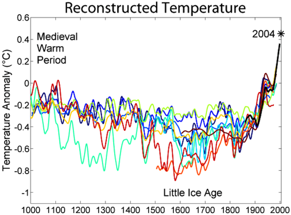
This graph looks over a very short period. Over a longer period we can see that, in the 20th century, the earth was recovering from a cold period known as the Little Ice Age. This lasted from about 1300 to 1870. During this period, winters were cold and glaciers advanced.
The data as to how warm it really was in the past is subject to much debate. Tree ring data is used to determine growth which in turn is used to estimate temperature. This allows for considerable discrepancy in the estimates for past temperatures. However, it can be seen that it is about as warm now as it was in the medieval warm period. The black line in figure 5 shows a predicted high temperature in 2004 that failed to materialize.
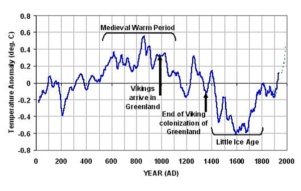
The figure below shows significantly higher temperatures in the Medieval Warm Period. This data uses non-tree ring proxies and is claimed to be more accurate. It serves to show the measure of disagreement about past temperature.
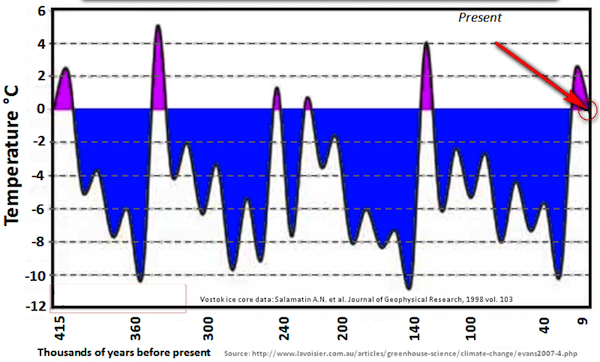
In the 1970’s the fear was for the next ice age. Traditionally interglacial periods last 10,000 years and the present Holocene period has lasted 11,400 years. It seems that we are destined for a new ice age. At its worst, huge areas of northern Europe, Canada, China, Russia and so on will be covered with permanent ice sheets. Our descent into this frozen world will be relatively slow, but inescapable. If we were to reverse the question to “How can we engineer climate warming to mitigate the next ice age?”, I doubt if we would look upon increased CO2 as being a very good bet.
Rising Oceans, Melting Ice and Glaciers
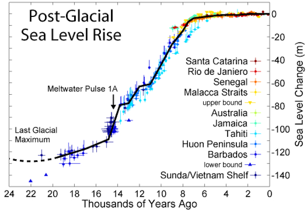
Oceans are actually rising by 2 to 3mm per year. The average over the last 15 years is 2.8mm. This is greater than the 100 year average, which is 1.8mm/year. Part of this rise is caused by the warming oceans and thermal expansion and part by melting ice. Even if the entire rise were caused by melting ice this would mean that 1100 km3 of land or non-floating ice is melting each year. Floating ice may also melt but this will make no difference to ocean height. The most extreme claim that I have seen for the volume of melting ice is 1400 km3. The estimate for the total amount of ice, including glaciers, is 28,000,000 km3, which means that there is enough ice for more than 20,000 years.
The primary reason for melting is that we are in an interglacial period. The ice that was created in the last ice age is slowly melting, the ice furthest from the poles melting first.
Glaciers are receding but they advanced during the Little Ice Age. They also advanced in the period AD 400 to 700 and then retreated during the mediaeval warm period.[3] The important point is that glaciers advance as well as recede and the current recession is not unusual, particularly as we are coming out of the Little Ice Age.
The recent IPCC claim that the Himalayan glaciers could disappear by 2035 was not just wrong but obviously wrong. The IPCC shrugged it off by saying that the pier review process had not worked very well, but anybody who knew anything about mountains must have known that it was a fallacy and yet the IPCC still published it. The average height of the Himalayas is 6000m and the snow line is around 5000m. Temperature drops some 8°C with each 1000m elevation. This means that even if the earth warmed by 2°C (as sometimes claimed) the snow line would elevate only 250m. The reality is that the earth is currently not warming and that our glaciers are not under threat.
Suggestions that the oceans could rise by 1m in the next 50 years or that the oceans are losing their salinity are just fanciful. Even the idea that we will inevitably become inundated assumes that we are unable to do today what the Dutch did over the last several hundred years; build dikes and reclaim land.
Ocean Acidity
We are now being told that our CO2 is contaminating the oceans, forming carbonic acid and making them more acidic. This in turn is ruining the habitat for coral reefs and anything else our worthy scientists can dream up. Ken Caldeira, a chemical oceanographer at Stanford University, said, “What we’re doing in the next decade will affect our oceans for millions of years. CO2 levels are going up extremely rapidly, and it’s overwhelming our marine systems.”
According to the Carbon Dioxide Information Analysis Center in 2006, we humans make some 28.4 billion tonnes of CO2; 11 billion tonnes are estimated to go into the atmosphere and the remaining 17 billion tonnes to the oceans. The weight of seawater in the oceans is 119,000,000 times greater than this (1.35*1018 tonnes). Furthermore the natural transfer of CO2 from the oceans and land to the atmosphere is large (696 billion tonnes) and dwarfs anything that man can do, being 60 times greater than man’s output to the atmosphere.
It does seem that the oceans are becoming slightly less alkaline. According to Wikipedia, the oceans’ pH has changed from 8.179 in the 1700’s to 8.104 currently. This 1% change brings the seas slightly closer to fresh water but a long way from even becoming neutral (pH = 7). The idea that our CO2 is turning the seas to an acid hell or even making any difference at all is not supported by the data.
Extreme Weather
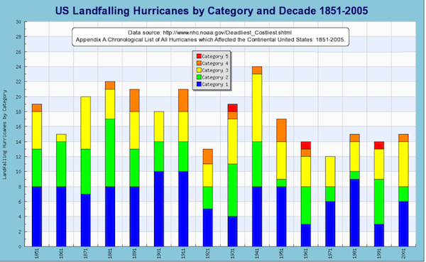
It is often claimed that the earth is subject to more hurricanes than before as a result of global warming and that this is going to get worse. The truth is that there is no change in the number of hurricanes as illustrated by figure 9. The damage caused by hurricanes has increased dramatically because of the high number of offshore and shoreline installations.
Climate Modelling
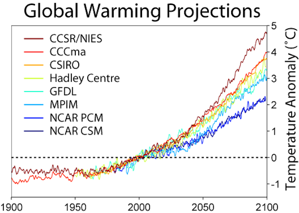
The climate models used by climate scientists are not normally made available for inspection by the general public and we are unable to judge the validity of the assumptions made. The methods used to forecast temperature have come under strong criticism. [5] We do know that the models fail to reproduce the cooling period from 1940 to 1970 and the slight cooling since 1998. It is also reported that the models over predict temperatures in the troposphere (ref 6). Individual model predictions vary wildly, from little or no warming to several degrees in the next 80 years. Clearly, at best, only one model can be correct yet the IPCC averages all accepted models to produce its “consensus” view. Furthermore the IPCC rejects models showing no warming as being “obviously wrong”. It is difficult to believe that those who predict 2°C warming accept that they are in a consensus with those who predict 5°C.
Modelling is notoriously difficult even when there are only a few variables. It assumes that we are able to separate out the precise effect of each of the variables and then combine them to make a coherent accurate model. Clearly none of the models as yet are able to do this and the number of variables is huge. We are asked to act on their predictions rather than on our own observations. We are told that we will pass the tipping point in the next few years, when dangerous and excessive warming will be irreversible. None of the actual data indicates that this is the case.
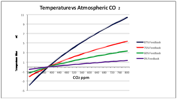
The IPCC published a rather simple model which predicts warming based solely on an increase in CO2 (i.e. no additional heating or feedback from increased water vapour). The idea was that the user could multiply the heating by whatever feedback factor considered appropriate. The main criticism of this model is that when it is used with added feedback to “predict” past temperatures, these are always lower than reality. In the graph below (figure 11), the current CO2 concentration is 380 ppm. If the IPCC equation is to be believed this demonstrates that there is little or no feedback or forcing. Equally, referring to figure 10, none of the models manage to reflect the warming period from 1910 to 1940.
Politicians
When politicians discuss climate change, they invariably refuse to engage on the factual or scientific issues and simply say that they are guided by the scientific advice. Apparently the debate is over. Periodically Lord Lawson defends the idea that the science is far from settled but is forced to admit that he is not a scientist.
The degree of ignorance among our politicians is frightening. Ed Miliband, the leader of the Labour party and the UK’s previous Secretary of State for Energy and Climate Change, talking to journalist Andrew Marr, was not aware that there had been slight cooling over the last 10 years. Miliband strongly supported the Copenhagen Treaty, which sought to award an annual budget of $160 billion to combat climate change. One wonders if he, or any other of the politicians at Copenhagen, had ever read the 80-page treaty.
The treaty is a strange document and, at times, seems to be written by social activists with clauses like this:
Ensure gender equity in planning and decision-making when implementing adaptation actions, recognizing the special needs, interests and knowledge of women, their particular vulnerability to climate change and their capacity to contribute to adaptation strategies…
I don’t think that many members of the general public in the West would be willing to hand over a cool $160 billion per year to people capable of writing this sort of “science”.
Recommendations
It would be good to live more frugally and that taxation should be aimed at making this more desirable. We need energy, particularly to help development in Africa, South America and parts of Asia. Oil and gas will eventually run out and coal is a dirty fuel. Nuclear energy, however unpopular, has been a total success in France and we should follow the French lead. We should continue to investigate other forms of energy and try to develop more economic forms. Currently wind energy is still expensive and requires back up capacity from conventional generators. Wave energy also requires wind and inevitably will need the same backup capacity. This need for backup capacity greatly increases the true capital cost for these forms of generation. We should curb the headlong rush into costly projects – there really is no hurry.
Above all, we should be nice to our equatorial and tropical neighbours – come the next ice age, we are going to need them!
– Nick O’Hear
References
1) Dipl. Biol. Ernst-Georg Beck StD – History of CO2 Gas Analysis of Air by Chemical Methods
2) Nicolas Caillon et al – Timing of Atmospheric CO2 and Antarctic Temperature Changes Across Termination III
3) Alberto V. Reyes et al – Expansion of Alpine Glaciers in Pacific North America in the First
Millennium A.D.
4) David Bellamy & Jack Barrett – Climate Stability: An Inconvenient Proof
5) Kesten C. Green & J. Scott Armstrong – Global warming: Forecasts by scientists versus scientific forecasts
6) Marshall Institute Policy Outlook – Temperature Changes in the Troposphere: Beyond the IPCC




2 Comments
Mr. O’Hear, your sources are not reliable.
The Marshall Institute is well known for distorting facts in pursuit of its ideological agenda. For example, in a 2009 essay, former Marshall Institute Executive Director Matthew B. Crawford, wrote that after he commenced with the group:
“…certain perversities became apparent as I settled into the job. It sometimes required me to reason backward, from desired conclusion to suitable premise. The organization had taken certain positions, and there were some facts it was more fond of than others. As its figurehead, I was making arguments I didn’t fully buy myself. Further, my boss seemed intent on retraining me according to a certain cognitive style — that of the corporate world, from which he had recently come. This style demanded that I project an image of rationality but not indulge too much in actual reasoning.”
Mr. O’Hear, in 1976 Steven Jobs and Stephen Wozniak designed and built the first Apple computer in Steven’s parents’ garage. Back then, the computer wasn’t much more than a wooden box with a small circuit board. Today, we can surf the web wirelessly and do infinitely more on the new 64GB Apple iPad.
The point I’m trying to make is that H. H. Lamb’s early and incomplete picture of global climate history (his famous graph with the “hump”) is not the most up to date snapshot global climate history available. Lamb’s data was limited and came almost entirely from northern Europe and overwhelmingly from central England. Since then, climate scientist have been able to take a much larger view by sampling over a much broader area of the planet. Subsequently, thousands of studies combined with a broad range of data have affirmed that Lamb’s so-called “Medieval Warming Period” was most likely a regional affect or aberration. In other words, the “hump” on Lamb’s original graph was much bigger than it should have been.
Fundamentally, ice core sample data, tree ring data, temperature records, you name it; all have been studied in great detail over the last 40 years. Lamb’s original graph based on data from one region has been replaced by many graphs from many regions. Essentially, when you plot the numbers, all of them, without exception, come out looking like hockey sticks. In other words, temperature data from around the world shows that global temperatures were relatively flat right up until about 1900 and have been rising steadily since then.
The bottom line on the so-called Medieval Warming Period is this:
More than a dozen subsequent scientific papers, using various statistical techniques and combinations of proxy records, produced reconstructions broadly similar to the original MBH hockey-stick graph, with variations in how flat the pre-20th century “shaft” appears. Almost all of them supported the IPCC conclusion that the warmest decade in 1000 years was probably that at the end of the 20th century.
For scientific opinions that really matter:
Read: Talent and Taste
http://harryhammer.wordpress.com/2010/09/19/talent-and-taste/
The Medieval Warm Period was global, synchronous and warmer than today.
Here’s a link to more charts.
http://www.intechopen.com/articles/show/title/a-regional-approach-to-the-medieval-warm-period-and-the-little-ice-age
Post a Comment