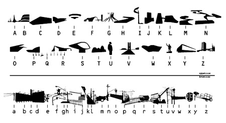
By GEOFF MANAUGH [BLDGBLOG] – Utopia, pictured above, is a “digital typeface that portrays the mixture between the modernist architecture of Oscar Niemeyer and informal occupation of the urban space that shapes major Brazilian cities.” In other words, all the letters look like buildings designed by Oscar Niemeyer, jumbled up in Brazilian proximities.
Continued at BLDGBLOG
Transcodification, with a twist.
By ANA PAULA COHEN [Mousse Magazine] – The typographic font called Utopia that you created in 2001 – with icons of Brazilian architecture by Oscar Niemeyer for the capital letters and urban interferences for the lower-case letters – dealt with these divergences. More than this, it involves the contradictions that we experience daily, proposing a way to compose new configurations through the combination of the permanent with the ephemeral, the official with the improvised, public construction with the interferences that the individuals make to live in this city…
Utopia is a kind of transcodification of this urban space, which is rewritten as a text. What we have in São Paulo is a blend consisting of the vocabulary of modernism mixed with slangs, twists, barbarisms, and new forms arising from the city’s needs and spontaneous uses. As if each person, giving his/her voice to the city, formed a polyphonic city.
Continued at Mousse Magazine | More Chronicle & Notices.


Post a Comment